
Sometimes you want one picture to have the color scheme of another. This is called color mapping or transfer. When I was making the rearranged images, I was concerned that I would get bad matches if I didn’t make sure the images were similar enough. It was helpful to ensure that their brightness histograms matched, but what about shifting the hue and saturation? And what color space should I use? Those are the questions for this post.
Time to work on some color transfer methods. We’ll call the image with the desired colors the “source” image, and the one that we’ll manipulate the “target” image. I tried three methods of mapping colors from the source to the target. There are example of the final results down below.
The first method is the simplest. For each color channel, I shifted and scaled the histogram of the target image to match the mean and variance of the source image. Easy.
The second method remapped the histograms of each channel to match. Fairly easy, as it just takes a few interpolations.
The third method is more involved. I wanted to extract the basic palette of colors from each image, which is a (future) post unto itself. For this, I applied Lloyd’s algorithm to the colors of each image. For simplicity, I decided to look for the 8 colors that best represent each image. With that, I was able to make a limited-palette version of each image. Then I paired each source color to a target color (minimizing the total squared distance between color pairs), and made swapped-limited-palette images. You can see these as the second image in each row, below.

Unfortunately, these are strongly banded, and don’t look great. To use smooth colors, I essentially used radial basis functions to decide how much of each color to contribute to each place. For the reconstructed target image, each pixel is recreated as the weighted sum of the source colors. The weight of each color (before normalization) is \exp(-d_{col}/d_0 ) , where d_{col} is the norm of the difference between the pixel and the paired target color. The scale d_0 was chosen to be one quarter of the average of the distances. These weights are normalized to one, and the new pixel value is the weighted sum of the source colors. This yields an image that is faithful to the limited palette, but without the sharp bands. This is visible in the image above as the third and fourth Mona Lisas.
Those are the three color transfer methods that I tried, but I haven’t chosen the best color space. Some publications say that CIELAB color space is best, as it more matches the human visual system. RGB is a simple baseline to check. HSV should be a terrible choice. Let’s try them all! Here, I’ve tried to transfer the color scheme of Starry Night to the Mona Lisa.

As expected, the HSV color space does terribly. The method with the discretized version doesn’t perform as well as I’d hoped, but is OK with RGB. The best methods seem to be with histogram matching of RGB or LAB, depending on personal preference and the pair of images.
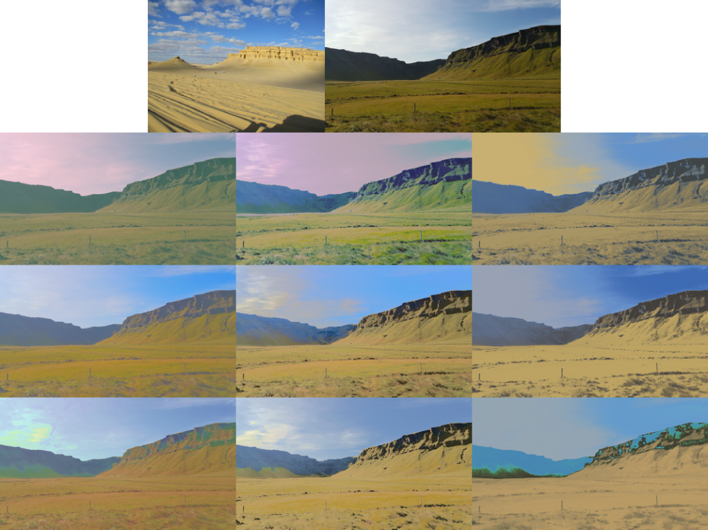
Let’s try some weird examples in the following gallery. The first one is a standard application: matching brightness across two photos. The others are more whimsical.


Color vision is weird.